To modify one theme, you have to customize the value of some variables in the platform-ui\platform-ui-skin\src\main\webapp\skin\less\variable.less file.
There are 4 main color variables. These are used to define color for majority of component.
Variable | Value | Description |
|---|---|---|
@baseColor | #000000 | Color of text, border, and other UI elements. |
@baseBackground | #ffffff | Color of background displaying content. |
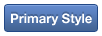
@primaryColor | #2f5e92 | Color of primary buttons and links. |
@primaryBackground | #f0f0f0 | Color of main background, for example, of header popup and tab items. |
The other colors are dependant on the 4 main colors above and can automatically adapt to the value of the @baseColor variable (dark or light). In particular:
Variable | Inheritance/Value if base color (@baseColor) is dark (lightness(@baseColor) < 50%) | Inheritance/Value if base color (@baseColor) is light (lightness(@baseColor) >= 50%) | Description |
|---|---|---|---|
@baseColorDark | lighten(@baseColor, 20%) (#333333) | lighten(@baseColor, 60%); | Default color of title, text, text input, and label. |
@baseColorMedium | lighten(@baseColor, 50%) (#808080) | lighten(@baseColor, 50%) | Text color of navigation links when being selected. |
@baseColorLight | lighten(@baseColor, 60%) (#999999) | darken(@baseColor, 20%) | Default color of small text, subtitle, and text field explanation. |
@borderColor | lighten(@baseColor, 80%) (#cccccc) | darken(@baseColor, 20%) | Default border color of box, container, and text input. |
@primaryBackgroundHover | darken(@primaryBackground, 4%) | darken(@primaryBackground, 3%) | Background color of table row, disabled input field, ready-only form, gray tab in a page when being hovered. |
@primaryBackgroundLight | lighten(@primaryBackground, 3%) | lighten(@primaryBackground, 4%) | Background color of table accent, hr line, well, and active pagination. |
@primaryDarkColor | darken(@primaryColor, 10.5%) (#224469) | darken(@primaryColor, 18.5%) | Border color of primary button, and left navigation. |
@primaryLightColor | lighten(@primaryColor, 18.5%) (#578dc9) | lighten(@primaryColor, 10.5%) | Background color of primary button, and dropdown when being hovered. |
@btnBackground | @baseBackground | @primaryBackground | Background color of default button. |
@btnBackgroundHighlight | @primaryBackground | @baseBackground | Background color of highlight button. |
@dropdownArrowRight | darken(@baseBackground, 20%) (#aac5e3) | lighten(@baseBackground, 90%) | Background color of arrow on the right of dropdown. |
@quotePrimaryBackground | lighten(@quotePrimaryBorder, 18%) | darken(@primaryColor, 10%) | Background color of primary quote. |
For each component, some own variables are defined. They may be new values, or be inherited from base variables. To modify these components, change value of these ones, or change the variables inherited (be careful if it impacts the others).

Variable
Inheritance
Description
@breadcrumbColor
@baseColorDark
Color of breadcrumb text.
@breadcrumbHoverColor
@primaryColor
Color of breadcrumb text when being hovered.
@breadcrumbActiveColor
@textLightColor
Color of breadcrumb text when being selected.
Variable
Inheritance/Value
Description
@btnColor
@baseColorDark
Text color of default button.
Gradient (@btnBackground, @btnBackgroundHighlight)
Gradient (@baseBackground,@primaryBackground)
Background color of default button (gradient background).
@btnBorder
@borderColor
Border color of default button.
Variable
Inheritance/Value
Description
Gradient (@btnPrimaryBackground, @btnPrimaryBackgroundHighlight)
Gradient (@primaryLightColor, @primaryColor)
Background color of primary button (gradient background).
@btnBorder
@btnPrimaryBorder
Border color of primary button.
@btnColor
@btnPrimaryColor
Text color of primary button.
Variable
Inheritance
Description
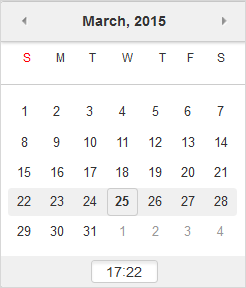
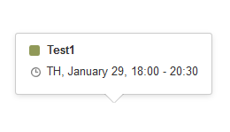
@calComponentDayTodayBackground
@primaryBackground
Background color of today.
@calComponentCurrentWeekBorder
@borderColor
Border color of current week.
@calComponentDaySelectedColor
@baseBackground
Text color of selected day.
@calComponentTimeInputBoxBackground
@primaryBackground
Background color of input value.
@calComponentDaySelectedBackground
@primaryColor
Background color of selected day.

Variable
Inheritance
Description
@dropdownBackground
@baseBackground
Background color of dropdown.
@dropdownLinkBackgroundHover
@primaryLightColor
Background color of hovered item.
@dropdownBorder
@borderColor
Border color of dropdown.
Form: input field, textarea, select box

Variable
Inheritance
Description
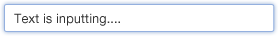
@inputBackground
@baseBackground
Background color of input field, text area and select box.
@inputBorder
@borderColor
Border color of input field, text area and select box.
@inputColor
@baseColorDark
Text color of input field and text area.
Variable
Inheritance/Value
Description
@inputFocusBorder
lighten(@infoColor, 30%)
Border color of hovered item.
@inputFocusColor
@inputColor
Text color of hovered item.

Variable
Inheritance
Description
@inputDisabledBackground
@primaryBackgroundHover
Background color of disabled item.
@inputDisableColor
@textLightColor
Text color of disabled item.
Variable
Inheritance
Description
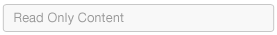
@formReadOnyBackground
@primaryBackgroundHover
Background color of read-only item.
@formReadOnyColor
@baseColorDark
Text color of read-only item.


Variable
Inheritance
Description
@warningBackground
@errorBackground
@successBackground
@infoBackground
@warningColorLight
@errorColorLight
@successColorLight
@infoColorLight
Background color of notifications.
@warningBorder
@errorBorder
@successBorder
@infoBorder
@warningColor
@errorColor
@successColor
@infoColor
Border color of notifications.
@warningText
@errorText
@successText
@infoText
@textColor
@textColor
@textColor
@textColor
Text color of notifications.
Variable
Inheritance
Description
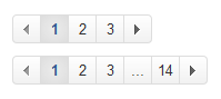
@paginationBackground
@baseBackground
Background color of paginator.
@paginationBorder
@borderColor
Border color of paginator.
@paginationActiveBackground
@primaryBackgroundLight
Background color of selected item in the paginator.
Variable
Inheritance
Description
@popoverBackground
@baseBackground
Background color of popover.
@popoverArrowColor
@popoverBackground
Background color of popover arrow.
Variable
Inheritance
Description
@uiPopupBackground
@baseBackground
Background color of popup.
@uiPopupBorder
@borderColor
Border color of popup.
@uiPopupHeaderBackground
@primaryBackground
Background color of popup header.

Variable
Inheritance/Value
Description
@tableBackground
transparent
Background color of table.
@tableBorder
@borderColor
Border color of table.
@tableBackgroundHover
@primaryBackgroundHover
Background color of hovered row.
@tableBackgroundAccent
@primaryBackgroundLight
Background of accent table.
Variable
Inheritance
Description
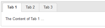
@tabNormalLinkBackground
@primaryBackground
Background color of tab item.
@tabNormalActiveLinkBackground
@baseBackground
Background color of selected tab item.
@tabNormalLinkBorder
@borderColor
Border color of tab item.
@tabNormalLinkColor
@textColor
Text color of tab item.
@tabNormalContentBackground
@baseBackground
Background color of tab content.
Variable
Inheritance
Description
@labelBackground
@baseColorLight
Background color of label.
@labelHoverBackground
@primaryLightColor
Background color of selected label.
@labelColor
@baseBackground
Text color of label.
Inheritance
Description
@primaryBackground
Background color of default badget.
@textColor
Text color of default badget.
@primaryColor
Background color of primary badget.
@baseBackground
Text color of primary badget.
@baseBackground
Background color of white badget.
@textColor
Text color of white badget.
Variable
Inheritance/Value
Description
@tooltipBackground
lighten(@black, 29%)
Background color of tooltip.
@tooltipArrowColor
@tooltipBackground
Background color of tooltip background.


PSDfolder contains all psd files. If user wants to customize some icons (for example, color), he/she can change these files.systemfolder contains icons, backgrounds, and images that are commonly used in all applications.themesfolder contains some themes of eXo Platform. The default theme is named "default". The others are themes that you can customize basing on the PSDs. You can also build your own theme by changing the PSD files.