Dialogs are Groovy templates that generate forms by mixing static HTML fragments and Groovy calls to the components responsible for building the UI at runtime. The result is a simple but powerful syntax.
These following parameters are common and can be used for all input fields.
| Parameter | Type | Required | Example | Description |
|---|---|---|---|---|
| jcrPath |
string
|
 |
jcrPath=/node/exo:title
| The relative path inside the current node. |
| mixintype |
string
with the commas (,) character.
|
 |
| The list of mixin types you want to initialize when creating the content. |
| validate |
string
with the comma (,) character
|
|
| The list of validators you want to apply to the input. Possible values are: name, email, number, empty, null, datetime, length OR validator classes. To know how to pass parameters to validators, refer here |
| editable |
string
|
|
editable=if-null
| The input will be editable only if the value of this parameter is
if-null
and the value of this input is null or blank.
|
| multiValues |
boolean
|
|
multiValues=true
| Shows a multi-valued component if true and must be used only with corresponding multi-valued properties. The default value of this parameter is false. |
| visible |
boolean
|
|
visible=true
| The input is visible if this value is true. |
| options |
String
separated by the commas (,) character.
|
|
"options=toolbar:CompleteWCM,height:'410px',noSanitization"
| A list of parameters which are input while the content templates are initialized. |
"name" validator:
String[] webContentFieldTitle = ["jcrPath=/node/exo:title", "validate=name", "editable=if-null"];


uicomponent.addTextField("title", webContentFieldTitle) ;
"email" validator:
String[] webContentFieldTitle = ["jcrPath=/node/exo:title", "validate=email", "editable=if-null"];


uicomponent.addTextField("title", webContentFieldTitle) ;
"number" validator:
String[] webContentFieldTitle = ["jcrPath=/node/exo:title", "validate=number", "editable=if-null"];


uicomponent.addTextField("title", webContentFieldTitle) ;
"empty" validator:
String[] webContentFieldTitle = ["jcrPath=/node/exo:title", "validate=empty", "editable=if-null"];


uicomponent.addTextField("title", webContentFieldTitle) ;
"null" validator:
String[] webContentFieldTitle = ["jcrPath=/node/exo:title", "validate=null", "editable=if-null"];


uicomponent.addTextField("title", webContentFieldTitle) ;
"datetime" validator:
String[] webContentFieldTitle = ["jcrPath=/node/exo:title", "validate=datetime", "editable=if-null"];


uicomponent.addTextField("title", webContentFieldTitle) ;
"length" validator:
For a maximum length of 50 characters:
String[] webContentFieldTitle = ["jcrPath=/node/exo:title", "validate=empty,length(50;int)", "editable=if-null"];


uicomponent.addTextField("title", webContentFieldTitle) ;
For a minimum length of 6 characters and maximum length of 50 characters:
String[] webContentFieldTitle = ["jcrPath=/node/exo:title", "validate=empty,length(6;50;int)", "editable=if-null"];


uicomponent.addTextField("title", webContentFieldTitle) ;
Note
The mixintype can be used only in the root node field (commonly known as the name field).
Additional parameters See also: Common parameters
<%

    String[] fieldTitle = ["jcrPath=/node/exo:title", "validate=empty"] ;

    uicomponent.addTextField("title", fieldTitle) ;

    %>
See also: Common parameters
String[] hiddenField5 = ["jcrPath=/node/jcr:content/dc:date", "visible=false"];

    uicomponent.addCalendarField("hiddenInput5", hiddenField5);
You cannot either see the non-value field on the form or input value for them. Its value will be automatically created or defined when you are managing templates.
Example
String[] hiddenField1 = ["jcrPath=/node/jcr:content", "nodetype=nt:resource", "mixintype=dc:elementSet", "visible=false"] ;

uicomponent.addHiddenField("hiddenInput1", hiddenField1) ;
| Parameter | Type | Required | Description | Example |
|---|---|---|---|---|
| rows |
Number
|
| The initial text area's number of rows. The value is
10
by default.
|
rows=20
|
| cols |
Number
|
| The initial text area's number of cols. The value is
30
by default .
|
cols=50
|
See also: Common parameters
<%

String[] fieldDescription = ["jcrPath=/node/exo:description", "validate=empty"] ;

uicomponent.addTextAreaField("description", fieldDescription) ;

%>
| Parameter | Type | Required | Description | Example |
|---|---|---|---|---|
| options |
string
with the semicolon (;) character
|
| Some options for CKEditor field: toolbar, width and height. |
options=CompleteWCM;width:'100%';height:'200px';
|
| toolbar |
string
|
| The predefined toolbar for CKEditor. The value can be: Default, Basic,
CompleteWCM, BasicWCM, SuperBasicWCM.
|
options=CompleteWCM
|
| width |
string
|
| The width of CKEditor. Its value can be the percent of pixel. |
options=width:'100%'
|
| height |
string
|
| The height of CKEditor. Its value can be the percent of pixel. |
options=height:'200px'
|
See also: Common parameters
<%

String[] fieldSummary = ["jcrPath=/node/exo:summary", "options=toolbar:CompleteWCM,width:'100%',height:'200px'", "validate=empty"] ;

uicomponent.addRichtextField("summary", fieldSummary) ;

%>
Creating a custom RichText editor fields
In the WYSIWYG widget section, you already know about a set of default toolbars (CompleteWCM, Default, BasicWCM, Basic, SuperBasicWCM). In this section, you will learn how to create a RichText editor with custom buttons.
Just edit the configuration file and modify or add new items to the configuration file of the
RichText
editor is located in:
webapps/eXoWCMResources/eXoConfig.js
Take a look at the eXoConfig.js file to see a definition of a custom toolbar named
"MyCustomToolbar":
config.toolbar_MyCustomToolbar = [

  ['Source','Templates','-','FitWindow','ShowBlocks'],

 ['Cut','Copy','PasteText','-','SpellCheck','-','Undo','Redo'],

 ['WCMInsertGadget','Flash','Table','SpecialChar', 'WCMInsertContent'],

 '/',

 ['Bold','Italic','Underline','StrikeThrough','-','JustifyLeft','JustifyCenter','JustifyRight','JustifyFull','-','OrderedList','UnorderedList','-','TextColor','BGColor','-','RemoveFormat'],

 ['Link','WCMInsertPortalLink','Unlink','Anchor'],

 '/',

 ['Style','FontFormat','FontName','FontSize']

] ;
Every toolbar set is composed of a series of "toolbar bands" that are grouped in the final toolbar layout. The bands items move together on new rows when resizing the editor.
Every toolbar band is defined as a separated JavaScript array of strings. Each string corresponds to an available toolbar item defined in the editor code or in a plugin.
Put the desired button names in square bracket ("[" & "]") and separate them by commas to create a toolbar band. You can look at the above code to know all the possible toolbar item. If the toolbar item does not exist, a message will be displayed when loading the editor.
Include a separator in the toolbar band by putting the "-" string on it.
Separate each toolbar brands with commas.
Use slash ("/") to tell the editor that you want to force the next bands to be rendered in a new row and not following the previous one.
Note
The last toolbar band must have no comma after it.
| Parameter | Type | Required | Description | Example |
|---|---|---|---|---|
| options |
string
|
| An option for the calendar field: Display time. |
options=displaytime
|
<%

String[] fieldPublishedDate = ["jcrPath=/node/exo:publishedDate", "options=displaytime", "validate=datetime", "visible=true"] ;

uicomponent.addCalendarField("publishedDate", fieldPublishedDate) ;

%>
See also: Common parameters
When you create an upload form, you can store an image by two main ways:
If you want to store the image as a property, use the following code:
<%

String[] fieldMedia = ["jcrPath=/node/exo:image"] ;

uicomponent.addUploadField("media", fieldMedia) ;

%>
If you want to store the image as a node, use the following code:
<%

String[] hiddenField1 = ["jcrPath=/node/exo:image", "nodetype=nt:resource", "visible=false"] ;

String[] hiddenField2 = ["jcrPath=/node/exo:image/jcr:encoding", "visible=false", "UTF-8"] ;

String[] hiddenField3 = ["jcrPath=/node/exo:image/jcr:lastModified", "visible=false"] ;

uicomponent.addHiddenField("hiddenInput1", hiddenField1) ;

uicomponent.addHiddenField("hiddenInput2", hiddenField2) ;

uicomponent.addHiddenField("hiddenInput3", hiddenField3) ;


String[] fieldMedia = ["jcrPath=/node/exo:image"] ;

uicomponent.addUploadField("media", fieldMedia) ;

%>
But, this code is not complete. If you want to display the upload field, the image must be blank, otherwise you can display the image and an action enables you to remove it. You can do as follows:
<%

  def image = "image";

  // If you're trying to edit the document

  if(uicomponent.isEditing()) {

  def curNode = uicomponent.getNode();

  // If the image existed

  if (curNode.hasNode("exo:image")) {

      def imageNode = curNode.getNode("exo:image") ;

      // If the image existed and available

      if (imageNode.getProperty("jcr:data").getStream().available() > 0 && (uicomponent.findComponentById(image) == null)) {

          def imgSrc = uicomponent.getImage(curNode, "exo:image");

          def actionLink = uicomponent.event("RemoveData", "/exo:image");

          %>

              <div>

                  <img src="$imgSrc" width="100px" height="80px"/>

                  <a href="$actionLink">

                      <img src="/eXoResources/skin/DefaultSkin/background/Blank.gif" alt="" class="ActionIcon Remove16x16Icon"/>

                  </a>

              </div>

          <%

      } else {

          String[] fieldImage = ["jcrPath=/node/exo:image/jcr:data"] ;

          uicomponent.addUploadField(image, fieldImage) ;

      }

  } else {

          String[] fieldImage = ["jcrPath=/node/exo:image/jcr:data"] ;

          uicomponent.addUploadField(image, fieldImage) ;

  }

  }  else if(uicomponent.dataRemoved()) {

  String[] fieldImage = ["jcrPath=/node/exo:image/jcr:data"] ;

  uicomponent.addUploadField(image, fieldImage) ;

  } else {

  String[] fieldImage = ["jcrPath=/node/exo:image/jcr:data"] ;

  uicomponent.addUploadField(image, fieldImage) ;

  }

%>
To have multiple upload fields, you just add the multiValues=true parameter to fieldProperty in dialog1.gtmpl:
  # Multi upload

  fieldProperty = ["jcrPath=/node/exo:value", "multiValues=true"];

  uicomponent.addUploadField("/node/exo_value", fieldProperty);
Note
In this case, you must be sure that the node type definition of the document you are currently editing should allow the document to have a child node named 'exo:value' whose node type is ' nt:unstructured'. All uploaded files of this upload component are stored in this 'exo:value' child node.
| Parameter | Type | Required | Description | Example |
|---|---|---|---|---|
| options |
string
with the comma (,) characters
|
| Some radio values. |
options=radio1,radio2,radio3
|
See also: Common parameters
<%

String[] fieldDeep = ["jcrPath=/node/exo:isDeep", "defaultValues=true", "options=radio1,radio2,radio3"];

uicomponent.addRadioBoxField("isDeep", fieldDeep);

%>
The select box widget enables you to render a select box with static values. These values are enumerated in a comma-separated list in the "options" argument.
| Parameter | Type | Required | Description | Example |
|---|---|---|---|---|
| options |
string
with the comma (,) characters
|
| Some option values. |
options=option1,option2,option3
|
See also: Common parameters
String[] mimetype = ["jcrPath=/node/jcrcontent/jcr:mimeType", "text/html", "options=text/html,text/plain"] ;

uicomponent.addSelectBoxField("mimetype", mimetype) ;
The argument with no key (here "text/html") is selected by default.
Advanced dynamic select box
In many cases, the previous solution with static options is not good enough and one would like to have the select box checked dynamically. That is what eXo Platform provide thanks to the introduction of a Groovy script as shown in the code fragment below.
String[] args = ["jcrPath=/node/exodestWorkspace", "script=ecm-explorer/widget/FillSelectBoxWithWorkspaces:groovy", "scriptParams=production"];

uicomponent.addSelectBoxField("destWorkspace", args) ;
The script itself implements the CMS Script interface and the cast is done to get the select box object as shown in the script code which fills the select box with the existing JCR workspaces.
import java.util.List ;

import java.util.ArrayList ;


import org.exoplatform.services.jcr.RepositoryService;

import org.exoplatform.services.jcr.core.ManageableRepository;


import org.exoplatform.webui.form.UIFormSelectBox;

import org.exoplatform.webui.core.model.SelectItemOption;

import org.exoplatform.services.cms.scripts.CmsScript;


public class FillSelectBoxWithWorkspaces implements CmsScript {


  private RepositoryService repositoryService_;


  public FillSelectBoxWithWorkspaces(RepositoryService repositoryService) {

    repositoryService_ = repositoryService;

  }


  public void execute(Object context) {

    UIFormSelectBox selectBox = (UIFormSelectBox) context;


    ManageableRepository jcrRepository = repositoryService_.getRepository();

    List options = new ArrayList();

    String[] workspaceNames = jcrRepository.getWorkspaceNames();

    for(name in workspaceNames) {

      options.add(new SelectItem(name, name));

    }

    selectBox.setOptions(options);

  }


  public void setParams(String[] params) {

  }

}
Note
It is also possible to provide a parameter to the script by using the argument "scriptParams".
| Parameter | Type | Required | Description | Example |
|---|---|---|---|---|
| options |
string
with the comma (,) characters
|
| Some checkbox values. |
options=checkbox1,checkbox2,checkbox3
|
See also: Common parameters
<%

String[] fieldDeep = ["jcrPath=/node/exo:isDeep", "defaultValues=true", "options=checkbox1,checkbox2,checkbox3"];

uicomponent.addCheckBoxField("isDeep", fieldDeep);

%>
See also: Common parameters
<%

String[] fieldId = ["jcrPath=/node", "editable=false", "visible=if-not-null"] ;

uicomponent.addMixinField("id", fieldId) ;

%>
One of the most advanced functionalities of this syntax is the ability to plug your own component that shows an interface, enabling you to select the value of the field.
In the generated form, you will see an icon which is configurable thanks to the selectorIcon argument.
You can plug your own component using the selectorClass argument. It must follow the eXo UIComponent mechanism
and implements the interface ComponentSelector:
package org.exoplatform.ecm.webui.selector;


import org.exoplatform.webui.core.UIComponent;

public interface ComponentSelector {

  public UIComponent getSourceComponent() ;

  public void setSourceComponent(UIComponent uicomponent, String[] initParams) ;

}
| Parameter | Type | Required | Description | Example |
|---|---|---|---|---|
| selectorClass |
string
|
| The component to display. |
selectorClass=org.exoplatform.ecm.webui.tree.selectone.UIOneNodePathSelector
|
| selectorIcon |
string
|
| The action icon. |
selectorIcon=SelectPath24x24Icon
|
Depending on the selectorClass, some other parameters can be added.
For example, the component
org.exoplatform.ecm.webui.tree.selectone.UIOneNodePathSelector
needs the following parameter:
| Parameter | Type | Required | Description | Example |
|---|---|---|---|---|
| workspaceField |
string
|
| The field which enables you to select a workspace. |
workspaceField=targetWorkspace
|
The component
org.exoplatform.ecm.webui.selector.UIPermissionSelector
does not need any special parameters.
<%

String[] fieldPath = ["jcrPath=/node/exo:targetPath", "selectorClass=org.exoplatform.ecm.webui.tree.selectone.UIOneNodePathSelector", "workspaceField=targetWorkspace", "selectorIcon=SelectPath24x24Icon"] ;

uicomponent.addActionField("targetPath", fieldPath)  ;

%>
The followings are predefined selectors which can be used in the action field to select an object from a list provided by the system. For example, to assign the permission to given users/groups, users must select them from a list of users/groups available in the system.
org.exoplatform.ecm.webui.tree.selectone.UIOneNodePathSelectorAllows selecting the node path.
org.exoplatform.ecm.webui.tree.selectone.UIOneTaxonomySelectorAllows selecting the category path.
org.exoplatform.ecm.webui.selector.UIGroupMemberSelectorAllows selecting the membership of a given group.
org.exoplatform.ecm.webui.component.explorer.popup.info.UIGroupSelectorAllows selecting a group.
org.exoplatform.ecm.webui.nodetype.selector.UINodeTypeSelectorAllows selecting node types.
org.exoplatform.ecm.webui.selector.UIPermissionSelectorAllows selecting permission expressions.
org.exoplatform.wcm.webui.selector.UIUserMemberSelectorAllows selecting users from a users list.
To add an interceptor to a dialog, you can use this method
uicomponent.addInterceptor(String scriptPath, String type)
.
| Parameters | Type | Description |
|---|---|---|
| scriptPath |
string
| The relative path to the script file. |
| type |
string
| The type of interceptor:
prev or post.
|
<%

uicomponent.addInterceptor("ecm-explorer/interceptor/PreNodeSaveInterceptor.groovy", "prev");

%>
Widgets are natively part of the eXo Platform product to provide a simple and easy way for users to get information and notification on their application. They complete the portlet application that focuses on more transactional behaviors.
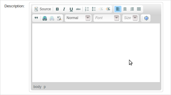
WYSIWYG stands for What You See Is What You Get. This widget is one of the most powerful tools. It renders an advanced JavaScript text editor with many functionalities, including the ability to dynamically upload images or flash assets into a JCR workspace and then to refer to them from the created HTML text.
String[] fieldSummary = ["jcrPath=/node/exo:summary", "options=basic"] ;

uicomponent.addWYSIWYGField("summary", fieldSummary) ;
String[] fieldContent = ["jcrPath=/node/exo:text", "options=toolbar:CompleteWCM,'height:410px'", ""] ;

uicomponent.addRichtextField("content", fieldContent
The "options" argument is used to tell the component which toolbar should be used.
By default, there are five options for the toolbar: CompleteWCM, Default, BasicWCM, Basic, SuperBasicWCM.
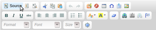
CompleteWCM: a full set of tools is shown.
The following buttons are shown: Source, Templates, Show Blocks, Cut, Copy, Paste Text, Undo, Redo, SpellCheck, WCM Insert Gadget, Flash, Table, Insert Special Character, WCM Insert Content Link, Bold, Italic, Underline, Strike Through, Justify Left, Justify Center, Justify Right, Justify Full, Ordered List, Unordered List, Text Color, Background Color, Remove Format, Link, WCM Insert Portal Link, Unlink, Anchor, Style, Font Format, Font Name, Font Size, Maximize.
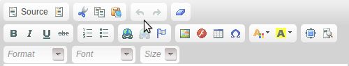
Default: a large set of tools is shown, no "options" argument is needed in that case.
The following buttons are shown: Source, Templates, Cut, Copy, PasteText, Undo, Redo, SpellCheck, RemoveFormat, Bold, Italic, Underline, Strike Through, Ordered List, Unordered List, Link, Unlink, Anchor, Image, Flash, Table, Special Character, Text Color, Background Color, Show Blocks, Style, Font Format, Font Name, Font Size, Maximize.
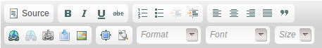
BasicWCM: a minimal set of tools is shown.
The following buttons are shown: Source, Bold, Italic, Underline, Strike Through, OrderedList, UnorderedList, Outdent, Indent, Justify Left, Justify Center, Justify Right, JustifyFull, Blockquote, Link, Unlink, WCM Insert Portal Link, WCM Insert Content Link, Show Blocks, Style, Font Format, Font Name, FontSize, Maximize.
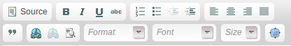
Basic:
The following buttons are shown: Source, Bold, Italic, Underline, Strike Through, Ordered List, Unordered List, Outdent, Indent, Justify Left, Justify Center, Justify Right, Justify Full, Blockquote, Link, Unlink, Show Blocks, Style, Font Format, Font Name, Font Size, Maximize.
SuperBasicWCM:
The following buttons are shown: Source, Bold, Italic, Underline, Justify Left, Justify Center, Justify Right, Justify Full, Link, Unlink, WCM Insert Portal Link, WCM Insert Gadget, WCM Insert Content Link.

There is also a simple text area widget, which has text-input area only:
String [] descriptionArgs = ["jcrPath=/node/exo:title", "validate=empty"];

uicomponent.addTextAreaField("description", descriptionArgs) ;
By using Content, all the stylesheets of each site can be managed online easily. You do not need to access the file system to modify and wait until the server has been restarted. For the structure, each site has its own CSS folder which can contain one or more CSS files. These CSS files have the data, and the priority. If they have the same CSS definition, the higher priority will be applied. You can also disable some of them to make sure the disabled style will no longer be applied into the site.
For example, the Platform demo package has two main sites by default: ACME and Intranet. The ACME site has two CSS files called BlueStylesheet and GreenStylesheet. The blue one is enabled and the green one is disabled by default. All you need to test is to disable the blue one (by editing it and setting Available to 'false') and enable the green one. Now, back to the homepage and see the magic.
Note
Remember the cache and refresh the browser first if you do not see any changes. Normally, this is the main reason why the new style is not applied.
Basically, if you want to add a rich text area to your dialogs, you can use the addRichtextField method. However, in case you want to add the rich text editor manually, you first need to use the addTextAreaField method and some additional Javascripts as shown below:
<%

String[] fieldDescription = ["jcrPath=/node/exo:description"] ;

uicomponent.addTextAreaField("description", fieldDescription)

%>

<script>

  var instances = CKEDITOR.instances['description'];

  if (instances) instances.destroy(true);

  CKEDITOR.replace('description', {

toolbar : 'CompleteWCM',

uiColor : '#9AB8F3'

  });

</script>
CKEditor Enter mode
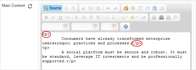
When creating/editing content with CKEditor, the Enter mode in CKEditor will determine the default behavior when users press the Enter key.
In eXo Platform, when you press the Enter key inside an editable text region, a new <p/> paragraph is created in the Source editor by default as below.
However, you can change the default behavior of the CKEditor Enter mode (<br/> line breaks or <div/> blocks) when creating a new dialog. For example, if you want the Enter mode to be displayed as <br/> rather than <p/> in CKEditor, simply add the following to the dialog.
String[] htmlArguments = ["jcrPath=/node/default.html/jcr:content/jcr:data", "options=toolbar:CompleteWCM,height:'410px',noSanitization,enterMode:CKEDITOR.ENTER_BR", htmlContent];
In case you want to change the default value from <p/> to <br/> for an existing dialog, follow the steps:
Click
 → →
on the top navigation bar.
→ →
on the top navigation bar.Select Templates, then click
 corresponding to one template (for example, Web Content) to open the View & Edit Template form.
Select the Dialog tab, then click
corresponding to the dialog that is currently used by the template (for example, dialog1).Replace the following in the Content field:
String[] htmlArguments = ["jcrPath=/node/default.html/jcr:content/jcr:data", "options=toolbar:CompleteWCM,height:'410px',noSanitization", htmlContent];
with the following:
String[] htmlArguments = ["jcrPath=/node/default.html/jcr:content/jcr:data", "options=toolbar:CompleteWCM,height:'410px',noSanitization,enterMode:CKEDITOR.ENTER_BR", htmlContent];
Save the above change, then go to
→ →
on the top navigation bar to see your change:i. Click
 on the Action bar.
ii. Select the template (Web Content in this example).
iii. Enter the content with line breaks by hitting the Enter key.
iv. Select
 in the Main Content field.
The behavior of Enter mode is now changed into <br /> as below.
in the Main Content field.
The behavior of Enter mode is now changed into <br /> as below.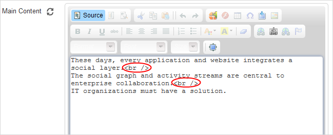
To avoid refreshing the first tab for every action execution, add a new private function to the template with tabs. In the template, you must insert a new piece of code like the following:
private String getDisplayTab(String selectedTab) {

if ((uicomponent.getSelectedTab() == null && selectedTab.equals("mainWebcontent"))

      || selectedTab.equals(uicomponent.getSelectedTab())) {

  return "display:block";

  }

  return "display:none";

  }


  private String getSelectedTab(String selectedTab) {

  if (getDisplayTab(selectedTab).equals("display:block")) {

  return "SelectedTab";

  }

  return "NormalTab";

  }
Changing in every event of onClick must be done like the following:
<div class="UITab NormalTabStyle">
<div class="<%=getSelectedTab("mainWebcontent")%>
  ">
  <div class="LeftTab">
<div class="RightTab">
  <div class="MiddleTab" onClick="<%=uicomponent.event("ChangeTab", "mainWebcontent")%>"><%=_ctx.appRes("WebContent.dialog.label.MainContent")%></div>
</div>
  </div>
</div>
  </div>

  <div class="UITab NormalTabStyle">
    <div class="<%=getSelectedTab("illustrationWebcontent")%>
      ">
      <div class="LeftTab">
    <div class="RightTab">
      <div class="MiddleTab" onClick="<%=uicomponent.event("ChangeTab", "illustrationWebcontent")%>"><%=_ctx.appRes("WebContent.dialog.label.Illustration")%></div>
    </div>
      </div>
    </div>
  </div>

  <div class="UITab NormalTabStyle">
    <div class="<%= getSelectedTab("contentCSSWebcontent")%>
      ">
      <div class="LeftTab">
    <div class="RightTab">
      <div class="MiddleTab" onClick="<%=uicomponent.event("ChangeTab", "contentCSSWebcontent")%>"><%=_ctx.appRes("WebContent.dialog.label.Advanced")%></div>
    </div>
      </div>
    </div>
</div>
Finally, to display the selected tab, simply add it to the style of UITabContent class.
<div class="UITabContent" style="<%=getDisplayTab("mainWebcontent")%>">In the content management sytem, its typical feature is enabling JavaScript in a content. This causes the XSS (Cross-site Scripting) attacks to the content displayed in the HTML format.
However, there is no solution to keep JavaScript and to prevent the XSS attacks at the same time, so Content
allows you to decide whether JavaScript is allowed to run on a field of the content template or not by using the
option
parameter.
To allow JavaScript to execute, add "
options = noSanitization" to the dialog template file. Normally, this file is nameddialog1.gtmpl.
For example: The following code shows how to enable JavaScript in the Main Content field of the Free Layout Webcontent content:
String [] htmlArguments = ["jcrPath = / node / default.html / JCR: content / JCR: data", "options = toolbar: CompleteWCM, height: '410px ', noSanitization" htmlContent];
By default, there is no "
options = noSanitization" parameter in the dialog template file and this helps you prevent the XSS attacks. When end-users input JavaScript into a content, the JavaScript is automatically deleted when the content is saved.